According to experts in several fields, including industrial-organizational psychology, neuroscience, and psychology, colors have a very real and tangible effect on how people act, react and even feel. The right office color schemes can also make a statement about a brand's image – the mood it seeks to inspire its customers, the energy it seeks to ignite in its staff, and the zones that support a variety of functions and flow within its space.

What is office color psychology?
Color psychology is the study of colors and how they affect people. Scientists observe changes in the body and brain that occur when people view certain colors. Office color psychology focuses on our subconscious reactions to various colors in the office environment, which can influence behavior, emotion and state of being. Certain colors can help to improve our productivity and well-being, whilst others work against us, severing focus and interrupting our general flow.
The connection between Color and Mood
Color triggers certain moods in people. This is something that is particularly interesting to big corporations that see utility in such matters. Simply speaking, color schemes can be used as a workplace advantage.
There are certain moods that are generally associated with colors.
• Warm colors – Yellow, red and orange are considered “warm” colors. They are said to cause feelings of warmth and comfort.
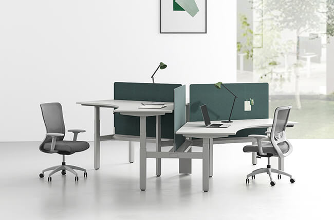
• Cool colors – On the other hand, colors like blue, purple and green are said to induce feelings of calm and serenity.
Let's take a look at 5 popular office colors and their impact when it comes to color psychology.

Blue: Productivity
Blue is the favorite color of many companies around the world because it is the number one booster for productivity. The calming, precise, and clinical hues of blue are good for invoking orderliness, confidence, calmness, and formality. It helps with concentration and, when combined with white, it makes every space look fresher.
Examples of rooms that could benefit from a little blue include:
Work and collaboration spaces
Meeting rooms
Research areas

To ring in a new era, Pantone announced that the Pantone Color of the Year 2020 is Classic Blue—a familiar, calming shade of azure.
Green: Balance & Harmony
Green can evoke a soothing mood and feelings of balance and harmony akin to the natural environment. Green is known to inspire creativity and productivity within the workplace. It helps staff think and speak clearly, great for areas that require presentations and when clear communication is required.
Best rooms to include green include:
Workspaces
Lounges
Employee relaxation areas
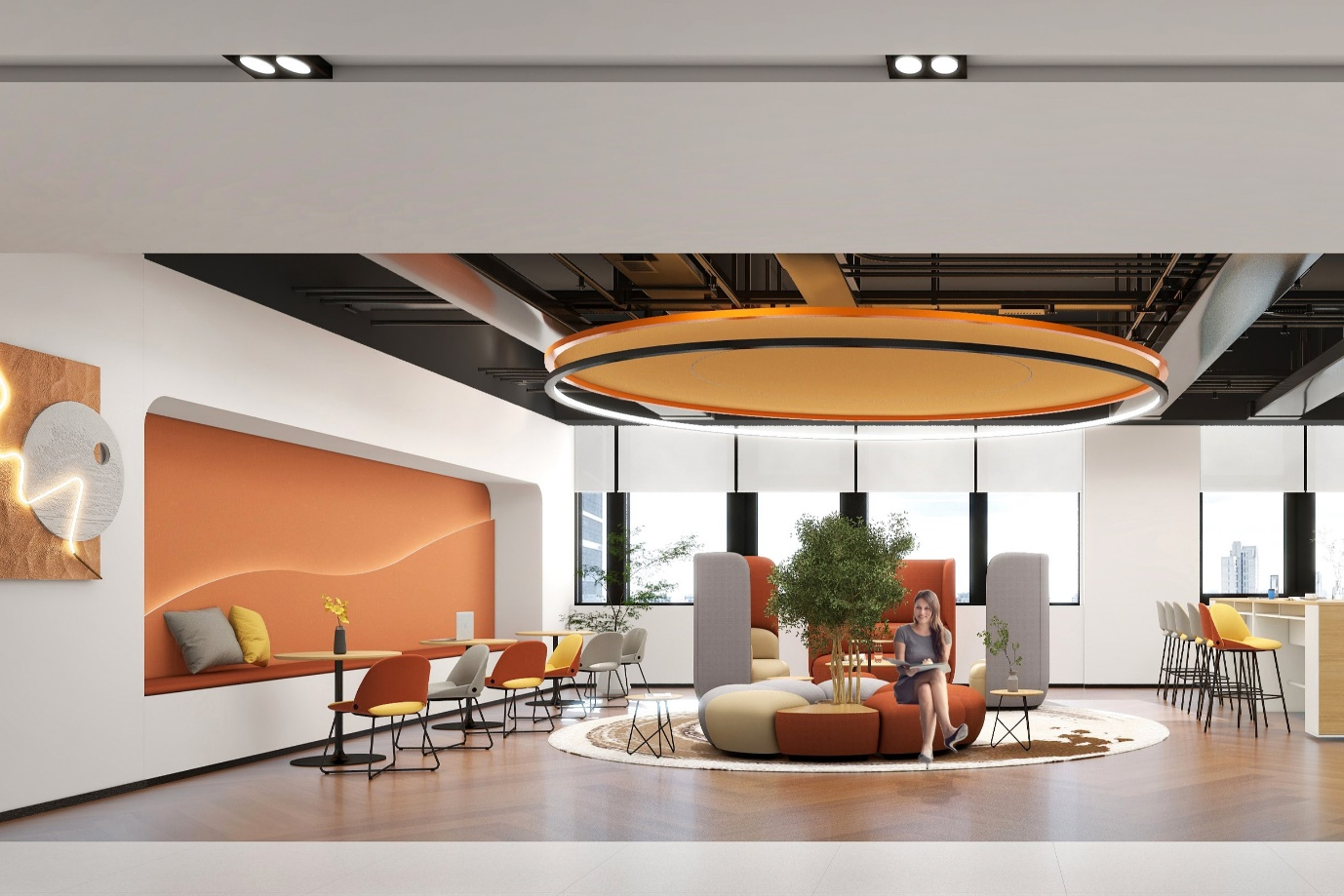
Red: Energy
Red can make people feel that a room is warmer than it actually is. Red works well in spaces that involve physical activity or night time work. Studies show increased blood flow, boosted heart rate, and more brain wave activity. However, red it's not the best color for offices that are less fast-paced, need high levels of concentration and involve a slower decision-making process.
Best areas to use red include:
Office cafeteria
Spaces with movement (hallways)
Areas where people work late at night
Yellow: Optimism
The color of sunshine and fun, yellow promotes cheer. Another good color for creativity, yellow can fuel optimism and innovation. For people who need a peppy place to work, yellow is a good choice. Every interior space overwhelmed with yellow nuances appears more warm, happy, and fun. It instills confidence and openness.
Best areas to use yellow include:
Collab spaces
Cafeteria
Lounges

White: Spaciousness
White is the color of spaciousness and practically compliments any of the other colors mentioned. White ties space together creates balance or gives a sense of neutrality. It makes spaces seem bigger and brighter, and research shows that all-white walls make employees more error-prone. When used as an accent color, white can either tone down bright colors or make them more vibrant, depending on how it's used.
Best rooms to use whites include:
Large recreational areas
Meeting areas with lots of natural light
Lobbies
The best thing to take away from this, is the fact that colors do impact the way we work. The subtle changes that adding a little color to an office can create will surprise you. To get the most out of your employees, it is beneficial to consider the psychology of color in office design to help create a positive and productive working environment.
Contact us to know more about our products, which are available in a wide range of colors.